Tim Hortons
Good Things Come In Every Package.
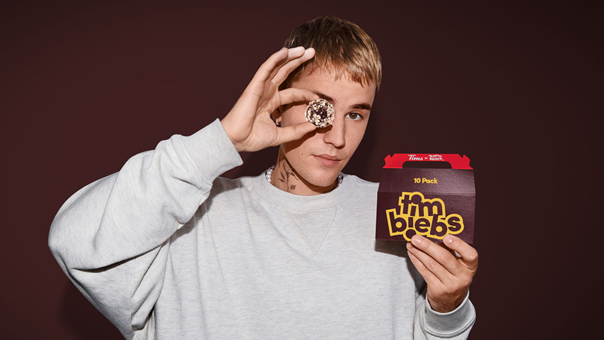
What stands out on a shelf filled with similar products is all in the packaging. A mix of brand name recognition, imagery or iconography, color and claims made visible at a glance and working in concert to say “Pick me!” For the launch of several Tim Hortons consumer packaged goods, we developed the look that did exactly that.
Service: Packaging
Client: Tim Hortons
Year: 2019

Tim Hortons took a while to toe-dip into retail. We knew that the taste experience would pay-off the purchase, but first we had to get them to choose us from shelves packed with competing products. Our team’s retail roll-out effectively translated a drive-thru brand into a billboard on-shelf and ultimately contributed to the development of 8 new retail SKUs within a one-year period and expansion into a robust global retailer network.